











Table of Contents
- 1 How to Create an SEO Ranking Report That Clients and Stakeholders Actually Understand
- 1.1 1. Define Report Purpose and Stakeholder Personas
- 1.2 2. Choose the Right KPIs for Ranking Reports
- 1.3 3. Visualize Rankings with Context that Nontechnical Stakeholders Understand
- 1.4 4. Connect Ranking Changes to Business Outcomes
- 1.5 5. Write Clear Insights and Prioritized Recommendations
- 1.6 6. Report Format, Cadence, and Distribution Best Practices
- 1.7 7. Automate and Scale Reports Using Ranklytics and Common Tools
- 1.8 8. Common Reporting Pitfalls and How to Fix Them
How to Create an SEO Ranking Report That Clients and Stakeholders Actually Understand
A usable seo ranking report does one thing: it turns rank numbers into decisions stakeholders can act on. This guide shows which KPIs matter for different audiences, three visuals that actually reduce questions, a reusable report template and short scripts for executive summaries, plus automation options using Ranklytics, Google Search Console, and Looker Studio. Read this if you want reports that get read, not ignored.
1. Define Report Purpose and Stakeholder Personas
**Start with who will use the report.** An seo ranking report that tries to answer everyone ends up answering no one — executives need business outcomes, marketers need campaign signals, and engineers need technical causes. Decide which persona is the primary reader and design the top of the report for that person.
Stakeholder personas, KPIs, and the one-sentence summary they actually want
- CMO or Founder — Business outcome focus: Recommended KPIs: visibility score, organic sessions, assisted conversions, leads or revenue attributed to organic traffic. Preferred format: one-page executive dashboard with a single annotated trend chart and 3 KPIs. Sample summary: Organic visibility up 12% month over month, estimated +250 sessions and 18 incremental leads; continue priority content push on Topic A.
- Marketing Manager — Campaign and channel focus: Recommended KPIs: top converted keywords, keyword ranking changes for campaign clusters, CTR, pages driving organic sessions. Preferred format: 3-5 page report with top movers table and a campaign-level breakdown. Sample summary: Target keywords for Campaign X improved from positions 10–5 with a 22% uplift in sessions; optimize meta titles for top 5 pages next sprint.
- Product Owner / Engineering Lead — Technical impact focus: Recommended KPIs: index coverage, page performance, crawl errors, average rank for technical priority keyword set. Preferred format: short appendix of raw exports plus annotated issues and one remediation priority. Sample summary: Indexability errors on category pages caused ranking decay; fix canonical and sitemap entries to restore visibility.
Trade-off to accept up front. You cannot pack every metric for every audience into the front page. The practical decision is to show the primary persona 3 clear KPIs and offer deeper layers for secondary readers via an appendix or an interactive dashboard link (for example use Ranklytics guide to website analysis).
Concrete example: For a B2B SaaS client the CMO cared about MQLs. We built a monthly seo ranking report that led with visibility score, MQLs from organic, and average rank for 20 priority keywords. When one prioritized keyword moved from position 9 to 3, the report flagged estimated click lift and the team prioritized reworking product landing copy — that change produced a measurable uptick in demo requests the following month.
Common misunderstanding and reality check. Many teams assume raw keyword tables satisfy marketers. They do not. Nontechnical stakeholders interpret long tables as noise; they need context — trends, impact estimates, and a clear next action. Resist the urge to show everything; attach exports for those who want them.
Checklist to ask before building the report
- Who is the primary decision maker for this report and what decision should they make after reading it?
- Which 3 KPIs map directly to business outcomes for that persona?
- What time window and baseline (month-over-month, quarter, year) should we use for trend context?
- Which source will be authoritative for each KPI (e.g., Google Search Console for clicks/impressions, analytics for conversions)?
- How will detailed data be provided to secondary readers (interactive dashboard link, appendix, raw export)?
2. Choose the Right KPIs for Ranking Reports
Cut the noise: pick a small, prioritized KPI set that links rankings to business impact. Raw position tables are for audits — stakeholder-facing ranking reports should surface directional metrics that predict clicks, leads, or revenue.
Core KPIs and how to calculate them
- Visibility score — a single number that summarizes search exposure across a tracked keyword set. Use a volume-weighted CTR model so high-volume queries move the needle. Example formula: Visibility = (Σi SVi CTRposi) / (Σi SVi CTRpos1) 100. CTR_pos values can come from a standard curve or your own Google Search Console data.*
- Weighted average rank for priority keywords — average rank where each keyword is weighted by search volume or business priority. Formula: AvgRank = Σ(ranki * weighti) / Σ(weight_i). Use this instead of median or raw rank lists when you care about exposure, not every tracked term.
- Estimated clicks (CTR model) and conversion estimate — translate rank movement into expected clicks using CTR by position. Then apply page conversion rate to estimate leads. This is noisy but gives stakeholders a business-facing number they understand.
- Top mover list (priority set) — short table of the 5–10 priority keywords that gained or lost >X positions with columns for change, estimated traffic impact, and conversions. Use this for action prioritization.
- SERP feature share — percentage of tracked keywords that trigger featured snippets, knowledge panels, product listings, or local packs. Changes here explain big swings in click share even when ranks look stable.
Practical trade-off: weight by search volume to reflect traffic potential, but understand the consequence: high-volume generic keywords will dominate your score even if they do not convert. If conversions matter more than raw traffic, swap volume weights for conversion or revenue weights.
Limitation to call out: CTR models are only estimates. SERP features, brand familiarity, and seasonality change click behavior. Always validate model outputs against actual clicks and conversions from Google Search Console and analytics.
Concrete example — turning a rank move into leads
Concrete Example: Keyword X has monthly search volume 5,000 and moved from position 8 to position 3. Using a conservative CTR curve (pos 8 = 2%, pos 3 = 8%), estimated clicks before = 5,000 0.02 = 100; after = 5,000 0.08 = 400; incremental = 300 clicks. If the landing page historically converts at 2%, that movement is ~6 incremental leads per month. Validate by comparing to actual clicks and conversions in Google Search Console and your analytics platform.
| KPI | When to show it | Why it matters |
|---|---|---|
| Visibility score | Executive one-line summary | Compresses rank distribution into a traffic-proxy that tracks exposure trends |
| Weighted average rank | Marketing managers, campaign owners | Shows direction for prioritized keywords while damping noise from low-value terms |
| Estimated clicks → leads | Commercial stakeholders | Translates position changes into a business outcome stakeholders can act on |
| Top movers (priority set) | Tactical handoff to content/SEO teams | Focuses work on the small set that will most likely change outcomes |
| SERP feature share | Competitive/technical reviews | Explains click share changes and surfaces opportunities for featured snippet optimization |
Practical insight: don't try to be perfectly precise. Use modelled KPIs to guide decisions, but attach confidence levels and validate monthly against raw clicks and conversions. If your visibility score and GSC clicks diverge materially, investigate SERP feature shifts, tracking mismatches, or sampling differences.
Next consideration: once KPIs are chosen, decide the time window and smoothing approach (rolling 7/30 days) so short-term volatility does not derail the narrative.
3. Visualize Rankings with Context that Nontechnical Stakeholders Understand
Key point: Visuals must answer two questions for nontechnical stakeholders: are rankings moving in a meaningful direction and will that movement change traffic or leads. A rank number alone does not do that — you need trends, relative weight of the keyword, and an outcome overlay such as organic sessions or conversions.
Three core visuals and how to build them
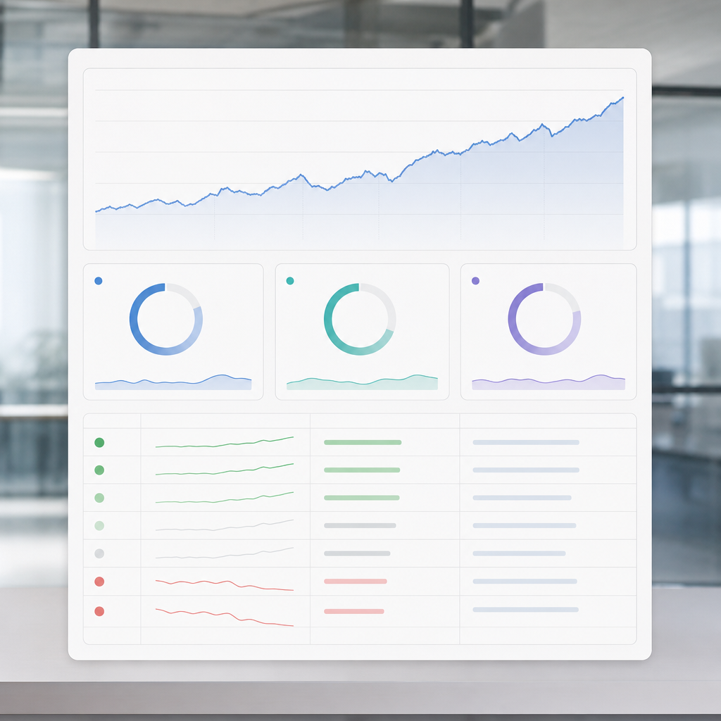
- Annotated rank trend chart: Plot average rank or visibility score for a prioritized keyword set over time with a secondary axis for organic sessions or conversions. Use a 28-day rolling average to smooth noise, annotate dates for campaigns and known algorithm updates, and color code upward movement green and downward movement red. Pull rank data from Ranklytics and clicks/impressions from Google Search Console.
- Position-distribution histogram: Show the share of tracked keywords in position buckets (1-3, 4-10, 11-20, 21+). This converts a long keyword list into an at-a-glance health metric – you can see whether gains are at the top of the funnel or actually moving into top 3 slots where CTR increases materially.
- Top movers table with impact columns: Surface the top 10 keyword movers and include columns for previous rank, current rank, estimated incremental clicks (CTR model), and recent conversions. This keeps discussion tactical – stakeholders see which single keywords to prioritize without wading through raw exports.
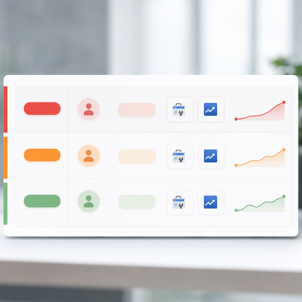
Design rules that matter: Always include the time window, axis labels, and the data source for the visualization. Use consistent color semantics across visuals – green for net positive, orange for volatile but improving, red for net negative. If you use an automated dashboard like Looker Studio, lock the date range on executive views to avoid accidental week-to-week comparisons.
Tradeoff to accept: Smoothing reduces noise but hides short-lived wins and SERP volatility. Use a 28-day rolling average for executive dashboards and provide a clickable drill-down to a raw 7-day view for campaign managers who need immediacy. Be explicit about which view the stakeholder is seeing so nobody mistakes noise for trend.
Concrete example: A B2B SaaS marketing lead tracked a 12-keyword priority set. The annotated trend chart showed average rank improving from 18 to 7 over three months while visibility score rose 38 percent. Overlaying sessions showed a 24 percent rise in organic leads; the visualization made it obvious that the content refresh launched on month two produced the lift and justified reallocating budget to more topic-cluster pages.
| Visual | Purpose | Best time window | Primary data sources |
|---|---|---|---|
| Annotated rank trend chart | Show direction + impact | 90 days with 28-day rolling average | Ranklytics, Google Search Console, Analytics |
| Position-distribution histogram | Communicate sweep of rankings | 30-90 days snapshot | Ranklytics export |
| Top movers table | Tactical next steps with estimated impact | Last 30 days | Ranklytics, Search Console, CRM/Analytics |

Next consideration: Decide the time windows and smoothing rules before you build the dashboard and document annotation policy – that single decision reduces the number of follow-up questions from stakeholders and keeps the conversation about strategy, not noise.
4. Connect Ranking Changes to Business Outcomes
Key point: A ranking move is only meaningful when it changes user behavior that your business measures — typically clicks, leads, or revenue. Present rank changes alongside the downstream metrics that stakeholders care about so the report answers the question they actually have: did this ranking change move the business needle.
How to show it: Use a two panel approach in your seo ranking report. Panel A pairs rank change for a small set of priority keywords or pages with organic sessions to those pages. Panel B pairs the same rank change with conversions or revenue where available. Use the same date ranges, mark major external events, and include a smoothing line or rolling average to reduce noise.
Worked example: estimate incremental clicks and leads from a rank move
Concrete Example: Keyword X moved from position 8 to position 3 over 30 days. Assume monthly search volume 1,000, CTR at position 8 ~ 2 percent and at position 3 ~ 10 percent, and on-page conversion rate 4 percent. At position 8 expected clicks = 1,000 0.02 = 20 clicks. At position 3 expected clicks = 1,000 0.10 = 100 clicks. Estimated incremental clicks = 80, estimated incremental leads = 80 * 0.04 = 3.2 leads (report as 3 leads and label as modeled estimate).
Limitation and tradeoff: These estimates depend on assumed CTR curves and a stable conversion rate. SERP features, seasonality, and query intent can make actual results much lower or higher. Always present modeled estimates with a confidence band and a short note on the assumptions used. If you omit assumptions, stakeholders will treat modeled numbers as facts and that breaks trust.
- When direct conversions are low: aggregate at page level rather than keyword level to increase signal. Pages often rank for many long tail queries; summing impressions and clicks by page reduces noise.
- Use proxy metrics: report assisted conversions, micro conversions like signups or downloads, or engagement metrics such as time on page and pages per session when direct leads are absent.
- Beware of cannibalization: a rank gain for one page can reduce traffic to another page on your site. Include a small table showing net traffic change across the primary content cluster to expose this effect.
Practical workflow: Pull keyword position and clicks from Google Search Console, map keywords to landing pages using your site structure or a sitemap export, then join to conversions from your analytics tool. Tools like Ranklytics can automate the keyword to page mapping and surface prioritized impact estimates for the top movers — use that to reduce manual calculation and maintain reproducibility.
Next consideration: For your next report pick one business metric to tie to ranking changes this month, document the estimation assumptions, and include a single recommended action so stakeholders can decide quickly.
5. Write Clear Insights and Prioritized Recommendations
Clear recommendations decide whether a report drives action or collects dust. Stop treating the insights section as commentary; make it a decision ticket list: what changed, why it matters, who does what, and when.
Executive summary template you can paste
Three-sentence template: Sentence 1 — what happened with the seo ranking report metrics (numbers and direction). Sentence 2 — why it matters for the business (traffic, leads, revenue or risk). Sentence 3 — recommended next step, owner, and expected timing.
Example: Organic visibility fell 8% month-over-month, driven by five priority keywords moving out of top 5. That change corresponds to an estimated 12% drop in monthly organic sessions to product pages, reducing expected leads by ~10. Action: content refresh for the three decaying pages assigned to Content (2 weeks) and a technical index check by Engineering (3 days).
Prioritization rubric (so stakeholders know why you picked these actions)
| Priority | Why it earns priority | Owner | Typical timeframe | Evidence to attach |
|---|---|---|---|---|
| High | Directly impacts revenue or top-priority keywords; >20% estimated traffic impact | Product/Marketing | 1-2 weeks | Rank trend, CTR change, GSC clicks, conversion estimate |
| Medium | Improves stability or addresses recurring friction; 5-20% traffic impact | Content/SEO | 2-6 weeks | Top movers list, content gap analysis, backlink notes |
| Low | Nice-to-have optimizations or long-term experiments; <5% short-term impact | Growth/Content | 1-3 months | A/B test plan, content calendar slot |
- Insight example 1: Several product category pages show content decay; core titles lost keywords to a competitor with fresher content. Recommended: refresh top 5 category landing pages and add a dated review cadence. Owner: Content. Priority: High.
- Insight example 2: A cluster of long-tail keywords moved up but no conversions followed because tracking is missing on the related CTA. Recommended: implement event tracking and run a one-week test to confirm traffic converts. Owner: Analytics. Priority: Medium.
- Insight example 3: Sudden rank drops across many pages coincide with a robots.txt change. Recommended: immediate technical review, revert or patch rules, and request reindexing. Owner: Engineering. Priority: High.
- Insight example 4: Backlink analysis shows lost links from two heavy-referring domains, correlating with lower visibility. Recommended: outreach to recover links and build 3 replacement links. Owner: Outreach/PR. Priority: Medium.
Practical tradeoff and limitation: Provide only 2-3 high-priority actions in the main section. Too many recommendations dilute execution — stakeholders will pick none. Include a larger appendix or automated export for the full list of low-priority fixes. Also label estimated impact as a range; click-through and conversion models are noisy and should not be presented as exact forecasts.
Real-world application: A B2C retailer saw a 30% drop in keyword ranking after merging two category pages. The ranking analysis in the seo ranking report identified canonical conflicts and title duplication. The team assigned Engineering to fix canonical tags within 48 hours and Content to merge and rewrite copy in one sprint; traffic recovered partially within three weeks and fully over two months.
How to phrase follow-up and task creation: For email: Short: We recommend two actions (Content refresh, Tech fix). Content owns refresh (2 weeks). Engineering owns index rules (48 hours). Please confirm owners and I will add tickets. For a 10-minute call: state the one-line summary, read the top action, confirm owner and deadline, then log tasks into your PM tool with a link to evidence in the report.
6. Report Format, Cadence, and Distribution Best Practices
Decide report format and cadence by the decision it must drive, not by what your tools provide. If a stakeholder needs to approve budget, deliver a clean one‑page business outcome snapshot. If they need to prioritize content tasks, give them a short actionable list with links to the source data.
Format choices and trade-offs
- Interactive dashboard (preferred for ongoing monitoring): live link to a Looker Studio or Ranklytics dashboard that stakeholders can filter. Trade-off: real-time access encourages digging but hides whether the numbers were validated that day.
- PDF one‑pager (executives): single-sheet snapshot with top KPI, one chart, and two recommended actions. Trade-off: readable and shareable, but becomes out of date the moment new data arrives.
- 3–5 page manager report: short narrative, annotated trend chart, top movers table, and appendix with raw export links. Trade-off: more context at the cost of longer production time.
- Raw CSV/XLS appendix for technical teams: full keyword export, crawl report, backlink list. Trade-off: transparency versus overwhelming nontechnical readers.
Practical insight: keep each stakeholder a single canonical view. Multiple versions spread across email attachments and dashboards create confusion — choose one canonical interactive link plus snapshot PDFs for meetings.
Cadence rules that actually work
Match cadence to business tempo. Monthly is the default for stable programs; weekly only for active launch windows; quarterly for strategic planning where seasonality or product cycles matter.
| Audience | Format | Cadence | Primary purpose |
|---|---|---|---|
| Executive / CMO | One‑page PDF + live dashboard snapshot | Monthly (quarterly deep dive) | Confirm business impact and resourcing |
| Marketing manager | 3–5 page report + dashboard filters | Monthly / Weekly during campaigns | Prioritize content and distribution work |
| Technical team | Raw exports + short incidents log | As needed (after deployments or drops) | Diagnose and fix technical regressions |
Distribution best practices — simple rules. Send the interactive link in a short email with a bold two‑line executive summary, attach a PDF snapshot for the meeting, and record a 5–10 minute walkthrough for people who prefer listening. Avoid burying the link in a long thread — put the link and summary at the top.
- Subject line format: Month YYYY — SEO ranking report — 2 metrics that matter (e.g., Sessions + Leads)
- Email top two lines: one sentence outcome, one sentence recommended action. Then the dashboard link.
- Permissioning: give read access to the dashboard and only export access to technical users. Maintain an access list and remove stale viewers quarterly.
Important limitation: automation reduces time but creates context drift. Automated dashboards and AI commentary (for example via Ranklytics) can generate narratives, but always add a human-verified note when anomalies or external events influenced results — otherwise stakeholders learn to distrust the report.
Concrete example: A B2B SaaS client switched to a monthly one‑pager for the executive team and a weekly filtered dashboard for content owners. The exec meeting dropped from 60 to 15 minutes because the one‑pager highlighted two clear items: top converting keywords and a single technical blocker. The content team used the weekly dashboard to pick three high‑impact pages to optimize, improving organic MQLs in the next month.
Final consideration: institute a changelog and ownership. If a ranking drop appears, the changelog tells you whether it was a site deploy, a campaign, or an external algorithm event — and assigns the next owner. Without that, reports become noise.
7. Automate and Scale Reports Using Ranklytics and Common Tools
Start with a reproducible pipeline, not a PDF template. Manual exports and copy-paste are the time sink; automation frees you to analyze instead of assemble. The sensible pipeline looks like: Ranklytics for keyword tracking and AI commentary, Google Search Console for clicks and impressions, Google Analytics or GA4 for conversions, a normalized data layer in Google Sheets, and Looker Studio as the delivery dashboard.
Step-by-step automation workflow
- Define the canonical keyword list in Ranklytics. Export the priority set (10–100 keywords) and tag them by persona and funnel stage.
- Connect Google Search Console to Looker Studio. Use the Search Console connector for daily refresh of clicks, impressions, and average position.
- Use Google Sheets as the normalization layer. Pull Ranklytics exports and GSC pulls into a single sheet to join keyword metadata, SERP feature flags, and traffic columns.
- Build a Looker Studio template. Create one dashboard that reads the normalized sheet and exposes filters for client, timeframe, and priority keyword set. See Looker Studio docs for scheduling.
- Automate commentary generation with Ranklytics AI. Configure Ranklytics to produce short insights for top movers and append them to the sheet as draft narrative blocks.
- Schedule delivery and alerts. Set daily refresh, a weekly summary email, and threshold alerts for drops larger than X positions or Y% visibility loss.
Practical trade-off: automation reduces labor but introduces new failure modes – API quotas, connector breakage, and AI hallucinations. Plan for monitoring: a broken connector can silently stop updates and produce stale dashboards that mislead stakeholders.
Quality control checklist. Validate three sample points each cycle: one priority keyword rank, one top-traffic landing page sessions, and one conversion event. Confirm date ranges match across sources and that visibility score calculations use the same window as the dashboard.
Concrete example: For a B2B client with 50 priority keywords we set up Ranklytics to tag keywords by product line, connected GSC and GA4 to Looker Studio, and used Google Sheets to join data. The first month saved the account manager roughly 8 hours assembling reports; more important, the manager used that time to turn Ranklytics AI notes into two prioritized content tasks that led to a measurable lift in organic form submissions.
Judgment call: rely on AI-assisted narrative for drafts but never send it verbatim to executives. In practice AI highlights are excellent for surfacing candidates, poor at nuanced causation. Human review prevents embarrassing or misleading statements and keeps the narrative tied to business outcomes.
- Alert thresholds to set: position drop > 5 places for top 10 keywords, visibility score fall > 10%, or page sessions down > 25% week-over-week.
- Annotation discipline: record releases, crawl fixes, or paid campaigns in a changelog column in the sheet so every dashboard change has context.
- Permissions: limit who can edit the normalized sheet; dashboards should be view-only for stakeholders.

8. Common Reporting Pitfalls and How to Fix Them
Straight answer: poor reports do more harm than no reports. A confusing seo ranking report creates false alarms, wastes stakeholder time, and hides the signal you are trying to measure.
Five high‑frequency pitfalls and practical fixes
- Vanity metrics over outcomes: Showing total tracked keywords and average position without tying to traffic or conversions gives executives a number that feels busy but means nothing. Fix by surfacing 3 outcome metrics first – visibility score, organic sessions from priority pages, and conversions – then put raw keyword lists in the appendix or a downloadable export.
- Mismatched date ranges and baselines: Comparing a 30 day window to year to date numbers or to a different period from another tool produces false positives. Fix by standardizing date windows across data sources and always include a rolling 90 day trend so stakeholders see context.
- Unannotated volatility: Drops after a site migration, an ad campaign, or a Google update look like failures when they are explainable events. Fix by logging SEO activities and annotating dashboards with deployment dates, marketing pushes, and known algorithm updates. Use a changelog in the report so readers see cause and effect.
- Mixing apples and oranges from different tools: Google Search Console shows impressions and clicks; rank trackers show position. Treat them as complementary not identical. Fix by labeling metric source clearly, and never chart raw positions and raw clicks on the same axis without normalization or separate panels.
- Over-aggregation that hides problems: A single site-wide average rank masks page level collapse. Fix by including both a top line summary and one drilldown: worst performing pages or keywords that lost more than X positions this period.
Tradeoff to accept: smoothing volatile rank movements improves readability but hides early signs of regression. Use a dual view – smoothed trend for executives and a raw movers list for operators – so you do not trade away investigatory capability for appearance.
Concrete example
Concrete Example: In one B2B client report the dashboard showed a 12 percent drop in organic sessions month over month while average rank improved. The cause was a date mismatch: Search Console was compared to the previous 28 days while Analytics used the calendar month. After standardizing to a 30 day rolling window and annotating a landing page A/B test, the apparent contradiction disappeared and the team focused on real conversion changes instead of chasing rank noise.
Real world note: automation tools will populate charts quickly but they do not judge context. Always validate automated insights against the changelog and a sample of raw data before sharing with stakeholders. Ranklytics and Looker Studio speed the build but human review prevents costly misinterpretation.
| Pitfall | Why it matters | Quick fix |
|---|---|---|
| Reporting raw keyword dumps | Stakeholders get lost and ignore the report | Show top 10 priority keywords and link to full export |
| Comparing different time frames | Creates false trends and bad decisions | Standardize windows and show rolling 90 day trends |
| No annotations for external events | Leads to blame and repeated work | Maintain a changelog and annotate charts |
| Confusing metric sources | Stakeholders assume metrics are interchangeable | Label sources and separate panels for different metric families |
Key takeaway: Fixing reporting mistakes is mainly operational – standardize windows, label sources, annotate events, and prefer a short prioritized view with an appendix for detail.

Written by
ranklytics