


Table of Contents
- 1 Mobile SEO Audit: Essential Checks to Improve Mobile Search Performance
- 1.1 Verify mobile indexing and crawl status
- 1.2 Measure mobile Core Web Vitals and page speed
- 1.3 Test mobile rendering and JavaScript indexing
- 1.4 Confirm content parity and structured data on mobile
- 1.5 Audit technical mobile issues: redirects, canonicals, and blocked resources
- 1.6 Evaluate mobile user experience issues that affect engagement and rankings
- 1.7 Prioritize findings and set an implementation plan using Ranklytics and other tools
- 1.8 Frequently Asked Questions
Mobile SEO Audit: Essential Checks to Improve Mobile Search Performance
With Google using mobile-first indexing for most sites, a focused seo mobile audit is no longer optional — it isolates the high-impact issues that cause ranking drops and poor engagement on smartphones. This guide gives a step-by-step checklist and concrete commands to verify mobile indexing, measure and fix Core Web Vitals, validate JavaScript rendering and structured data parity, and root out technical problems like redirects, blocked resources, and broken canonicals. You will also get a practical prioritization framework and a release checklist so fixes can be assigned, deployed, and validated quickly in Search Console and real user metrics.
Verify mobile indexing and crawl status
Key point: If Google is not indexing the mobile version of your pages, fixing speed or content is irrelevant until crawl access and indexing are resolved. Use Search Console and server logs together to separate access problems from indexing decisions.
Quick checks in Google Search Console
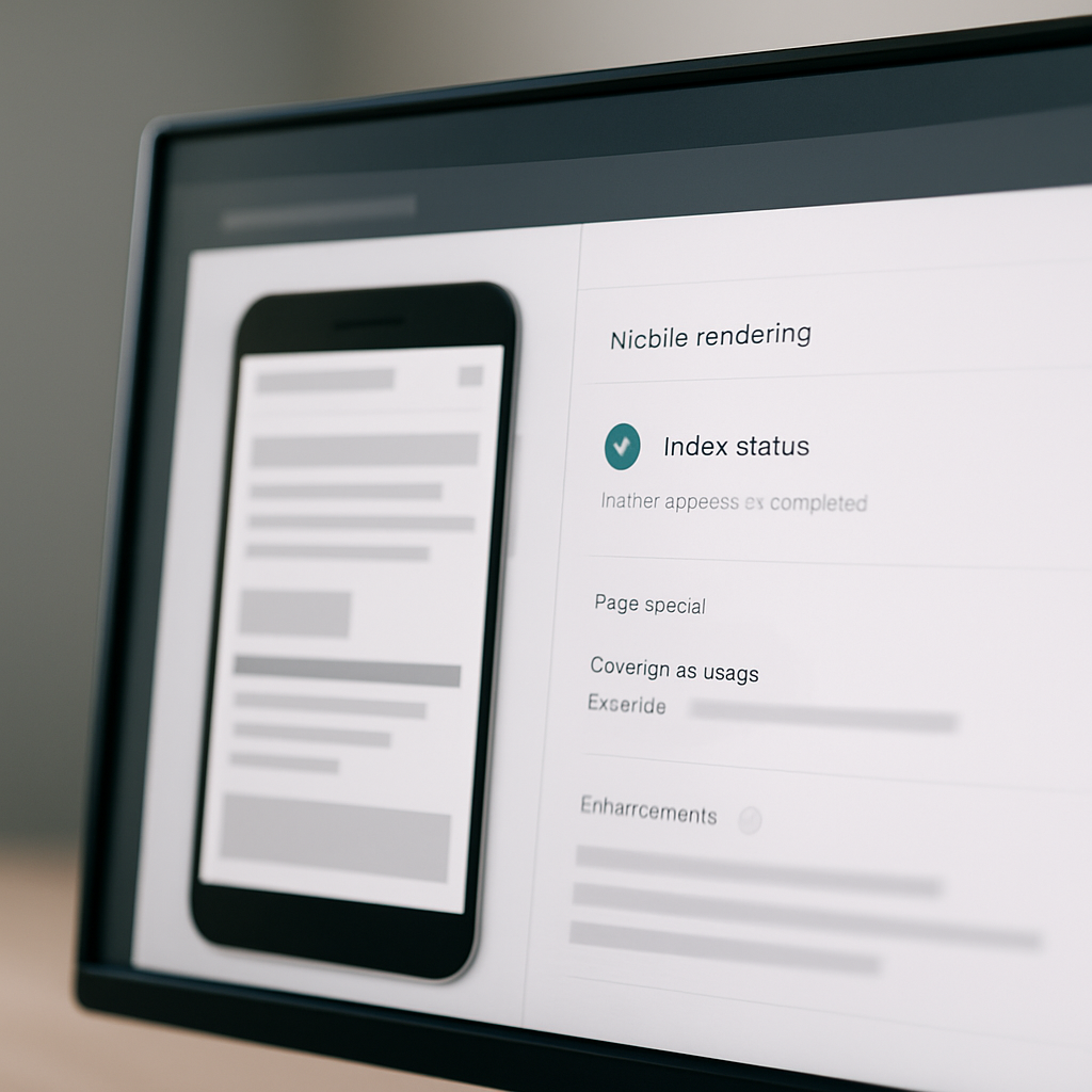
URL Inspection: Paste the page URL, switch the test to the mobile view, and check both the Fetch as indexed result and the Rendered HTML. If the mobile render omits primary content or structured data, that is a red flag for mobile-first indexing parity.
- Coverage check: Open the Coverage report and filter for errors and valid with warnings on pages submitted by your sitemap. Prioritize pages that drive mobile traffic.
- Live test render: Use the Live Test in URL Inspection to confirm Googlebot Smartphone sees the same visible content you expect.
- Sitemap and indexing: If mobile pages are accessible but not indexed, submit the sitemap and request indexing for priority URLs.
Log analysis to confirm Googlebot Smartphone crawling
Practical command: Search logs for Googlebot hits to confirm crawls are succeeding and note response codes. For most access logs a simple approach is grep Googlebot access.log | grep -i smartphone | awk {print $4, $9, $12} to extract timestamp, response code, and request path. Adjust field indexes to match your log format.
Tradeoff and consideration: Relying on user agent strings alone is fragile because some bots spoof UA headers and security rules sometimes block Googlebot by mistake. Where possible crosscheck logs with the IP ranges in Google documentation or use Search Console crawl stats as a secondary source.
Concrete example: On a recent ecommerce audit we found mobile impressions dropped after a WAF rule began blocking requests containing the substring Mobile. Search Console showed pages as available but not crawled by Googlebot Smartphone. After whitelisting the legitimate Googlebot UA and reissuing the sitemap, Google recrawled key templates and mobile impressions recovered within two weeks.
Common misunderstanding: Many teams assume a successful desktop fetch equals a successful mobile fetch. In practice mobile-first indexing means Google may fetch with a different user agent and different resource constraints. Always validate the mobile render separately instead of inferring from desktop results.
If you see 403 or 5xx responses to Googlebot Smartphone in logs, treat that as a higher priority than speed optimizations. Fix access before performance tuning.
Next consideration – after you confirm Googlebot Smartphone can fetch and index your mobile pages, move to validate rendering and content parity in the mobile render. Use the Google Mobile First Indexing guidance for edge cases and check how Ranklytics can monitor mobile indexing and surface pages that lose mobile coverage in real time via Ranklytics site audit.
Measure mobile Core Web Vitals and page speed
Start with field signals, debug with lab runs. Core Web Vitals on mobile are the metric set you will iterate against, but the way you measure them changes what you fix. Use field data to prioritize templates that actually drive organic sessions, then use lab tools to reproduce and diagnose the root causes.
Field data versus lab data: what to collect
Gather both Chrome UX Report and PageSpeed Insights field data for your high-traffic mobile landing pages to see real-user LCP, CLS, and INP trends. Then run Lighthouse from Chrome DevTools with device emulation set to a mid-tier phone (for example Pixel 2) and network throttling to Slow 4G plus CPU slowdown to reproduce issues locally. Use PageSpeed Insights to combine field and lab results and web.dev/measure for quick site-wide snapshots.
- What to capture for prioritization: store CWV metrics by page template, mobile organic sessions, and conversion rate so you focus on templates that move business metrics.
- What to capture for debugging: network waterfall, render-blocking resources, long main-thread tasks, large image requests, and layout shift sources from the Lighthouse trace.
- Useful command: run
lighthouse https://example.com --preset=mobile --output=jsonto collect reproducible lab artifacts for a page.
Practical tradeoff: optimization choices often pit engineering time against user-visible gains. Swapping to AVIF/ WebP reduces payloads quickly but may require build pipeline changes and fallback handling; adopting server-side rendering for a JS app fixes many CWV problems but increases backend complexity and deployment risk. Pick the fix that delivers the most mobile sessions per engineering hour.
High-impact remediation patterns (prioritize by template)
- Optimize hero assets: responsive
srcset, correctsizes, andpreloadthe largest hero image to reduce LCP. - Reduce JS execution: identify long tasks in the Lighthouse trace, code-split, and defer noncritical scripts to lower INP and total blocking time.
- Serve critical CSS and defer the rest: inline minimal critical CSS for above-the-fold content on high-value templates.
- Improve server response: enable gzip/ brotli, reduce Time to First Byte for mobile caches or CDNs.
Real-world application: On a recent mobile SEO audit for an ecommerce site, the primary landing template suffered slow LCP from a 1.8MB hero JPEG and a render-blocking analytics script. The team converted the image to AVIF with responsive srcset, added a preload for the hero, and deferred the analytics loader. The result: reproducible LCP drops in lab runs and faster CWV field medians for that template within a week after deployment.
Measure outcomes by template, not by site average. Aggregates hide the pages that cause ranking and engagement problems.

Test mobile rendering and JavaScript indexing
Direct check: If the mobile HTML you serve lacks the primary content that search needs, Google can index a stripped-down version of the page. That failure shows up as missing headings, empty product descriptions, or absent JSON-LD in the rendered DOM — and no amount of speed tuning will fix ranking if the content never reaches the indexer. See Google JavaScript SEO basics for how Google processes JS, but treat that as background; your job is to prove what Google actually sees on mobile.
How to compare raw HTML and the mobile-rendered DOM
- Fetch the initial HTML: use a mobile user agent to save the server response, for example
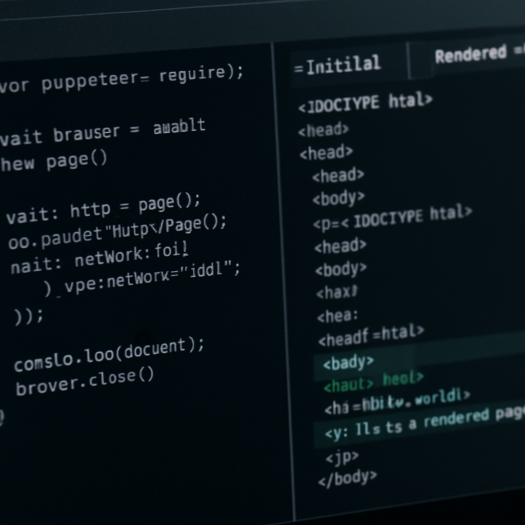
curl -A Mozilla/5.0 (Linux; Android 9; Pixel 3) AppleWebKit/537.36 (KHTML, like Gecko) Chrome/90.0.4430.85 Mobile Safari/537.36 -s https://example.com/page > initial.htmlto inspect what the server returns before JS runs. - Capture the rendered DOM: run a headless browser to capture post-JS content. Example Puppeteer snippet:
const puppeteer = require(puppeteer); (async()=>{const b=await puppeteer.launch();const p=await b.newPage();await p.setUserAgent(Mozilla/5.0 (Linux; Android 9; Pixel 3)...);await p.goto(process.argv[2],{waitUntil:networkidle2});console.log(await p.content());await b.close();})();thennode render.js https://example.com/page > rendered.html. - Compare artifacts: diff
initial.htmlandrendered.htmlfor headings, product text, and JSON-LD. If critical content only appears inrendered.html, the page depends on client execution to be indexed.
Tradeoff to weigh: moving content into the initial HTML (SSR or prerender) increases backend complexity and deployment risk, while client-only rendering keeps simpler deployment but risks indexing gaps and slower perceived load on mobile. Use dynamic rendering or prerendering as a pragmatic short-term fix for the most important templates, but plan for a permanent SSR or progressive hydration strategy if mobile search is a core acquisition channel.
- Symptom – Headings present but no product specs in rendered DOM: indicates XHR-loaded content that Google may not wait for on mobile under a tight render budget.
- Symptom – JSON-LD absent in initial HTML but present after JS: structured data won't be consistently detected; fix by injecting JSON-LD server-side for key pages.
- Symptom – Content only appears after user click/scroll: that content is not reliably indexed; move critical content into the top-level DOM or provide accessible fallbacks.
Concrete example: An ecommerce SPA loaded product specs via an XHR triggered after DOMContentLoaded. A quick puppet-run showed initial HTML missing those specs while the rendered DOM contained them. The team added server-side rendering for the product template and embedded the core JSON-LD in the HTML. Within three weeks Search Console showed those URLs generating product-rich impressions again and mobile clicks recovered for the affected SKUs.
Key point: Google can execute JavaScript, but it has a render budget and mobile constraints. Prove indexability with both a raw HTML fetch and a headless-rendered snapshot — one without the other is a guess.
Confirm content parity and structured data on mobile
If the mobile version lacks the same primary content and structured data as desktop, mobile search visibility and rich results break. Treat parity as a binary gate: either the mobile page presents the same indexable content and JSON-LD as desktop, or you risk partial indexing, missing snippets, and unpredictable ranking changes.
Practical verification workflow
Start with two artefacts for the same URL: the server response as returned to a mobile user agent and the post-JS rendered DOM. Use a quick server fetch to verify the presence of critical tags and structured data before spending time on headless rendering. Example command to grab the server response: wget --user-agent=Mozilla/5.0 (Linux; Android 9; Mobile) AppleWebKit/537.36 (KHTML, like Gecko) Chrome/90.0.4430.85 Mobile Safari/537.36 -qO- https://example.com/page > mobileinitial.html then grep -n application/ld+json mobileinitial.html to confirm JSON-LD exists in the initial HTML.
- Check canonical and meta parity: confirm
link rel=canonical,title, andmeta descriptionare equivalent or intentionally different for mobile-serving setups. - Validate parsed structured data on mobile: run the Rich Results Test on the URL and compare the detected items to a desktop run to find missing types like Product, Breadcrumb, or FAQ.
Tradeoff to consider: injecting JSON-LD via a tag manager or late-running script is fast but fragile. Google may not parse script[type=application/ld+json] that is added after the render budget expires on mobile. The more robust option is server-side inclusion of critical JSON-LD, which costs engineering time but guarantees consistent parsing.
Concrete example: an ecommerce site lost product rich results after a front-end refactor. The desktop HTML retained the Product JSON-LD, but the mobile-serving template stripped nonvisible script blocks to slim payloads. The engineering fix was to move core JSON-LD into the server template for mobile, which restored product impressions and rich snippets within three weeks.
Deeper judgment: teams often assume parity is only visual. In practice meta tags, alt text, structured data payloads, and canonical signals matter more for indexing and rich results than cosmetic differences. Prioritize server-side fixes for structured data on the top templates that drive mobile organic sessions rather than trying to patch everything client-side.
Validate both the initial HTML and the rendered DOM for structured data. If they differ, treat that template as high priority for server-side correction.

Audit technical mobile issues: redirects, canonicals, and blocked resources
Direct point: Redirects, broken canonicals, and blocked resources are the technical faults that most often break mobile indexing or silently degrade mobile rankings. These three areas are low-effort to detect and high-impact to fix, but they require different checks than a desktop audit.
Redirect chains and latency
What to test: Follow redirects with a mobile user agent and inspect each Location header and response time. Long chains and platform-specific redirects add round trips on Slow 4G and will push LCP and crawl throughput in the wrong direction.
Quick command: Run curl -IL -A Mozilla/5.0 (Linux; Android 9; Pixel 3) AppleWebKit/537.36 (KHTML, like Gecko) Chrome/90.0 Mobile Safari/537.36 (compatible; Googlebot/2.1; +http://www.google.com/bot.html) https://example.com/page to see the full chain and final status. If you see multiple 3xx hops or a 200 served after a 302 to a different host, that is a performance and indexing risk.
Practical tradeoff: Consolidating redirects usually wins: remove unnecessary hops, prefer direct links, and avoid device sniffing that sends separate mobile-only redirects. If you must maintain m-dot and www variants, document canonical relationships and ensure the mobile user agent receives the same 200 logic as other agents.
Canonicals and mobile URL setups
Problem pattern: Separate mobile URLs are still used. When canonical tags point to the wrong version or are inconsistent between mobile and desktop, Google can index the unintended URL or ignore mobile content. Responsive design removes most of these failure modes.
Practical fix: For an m-dot setup, ensure each mobile URL has rel=canonical pointing to itself if it is the primary indexable version, and the desktop URL includes rel=alternate to the mobile URL where appropriate. For responsive sites, canonical tags should point to the same canonical across device views. Use the URL Inspection tool to confirm Search Console reports the expected canonical.
Real-world example: An ecommerce site used device sniffing to redirect smartphone users to m.example.com while leaving desktop canonicals pointing at example.com. Google started indexing desktop canonical URLs for product pages and mobile impressions declined. The fix was to harmonize canonicals so mobile and desktop point to the same preferred URL and to remove the device-based redirect for canonical pages. Mobile impressions and product snippet restores followed after reindexing.
Blocked resources that break rendering
Core check: Mobile render failures are often caused by robots.txt or firewall rules blocking critical JS or CSS. If Googlebot Smartphone cannot fetch core assets, the rendered DOM may omit content or structured data and mobile-first indexing will fail for that page.
Example robots.txt trap: Disallow: /static/js/ or Disallow: /assets/ will commonly block libraries and inline loaders needed to render content. Use the robots.txt Tester in Search Console and then run the URL Inspection live test in mobile mode to see what Googlebot Smartphone can render.
Operational note: CDNs, WAFs, or security rules sometimes block crawlers by fingerprinting mobile-like headers. If logs show differing response codes for Googlebot Smartphone versus other agents, whitelist Googlebot IPs per Google guidance and validate with server logs. Where you cannot immediately change WAF rules, serve a minimal server-side fallback for critical pages.
curl -IL checks, Search Console live render, and a headless render snapshot.Final judgment: If you only have time for one technical mobile fix, validate and correct redirect and canonical behavior first. They are cheap to test, easy to communicate to engineering, and directly affect what Google indexes on mobile. After that, remove blocking rules for critical assets before spending cycles on heavy performance work.
Evaluate mobile user experience issues that affect engagement and rankings
Immediate observation: small UX defects on mobile — mis-sized tap targets, poor viewport configuration, and cumulative layout shifts from late-loading elements — convert visits into lost rankings faster than most people expect. Fixing these is often cheaper and faster than chasing a marginal backlink or a content rework.
Practical UX checks that move the needle
- Viewport and scaling: verify the page uses a correct viewport meta and that content does not require pinch-zoom. Mobile searchers abandon pages they must zoom to read.
- Touch targets: ensure interactive elements meet recommended size and spacing; small buttons in conversion funnels correlate strongly with form abandonment on phones.
- Layout shifts: identify elements that shift because images, fonts, or ads load late; mark any element with a nonzero layout shift contribution as high priority.
- Interstitials and overlays: remove or replace full-screen popups with native banners for mobile; intrusive interstitials still reduce click-through and can trigger search penalties.
- Font legibility and line length: confirm body text renders at readable sizes on common viewport widths and that long lines are wrapped appropriately.
How to validate quickly: use Chrome DevTools mobile emulation for touch target inspection and the Performance panel to capture visual stability traces. For real-world confidence, pull a small RUM sample (one week) and segment by device class to spot which templates show elevated abandonment or short sessions on phones.
Tradeoff to call out: aggressive ad or personalization scripts improve revenue but often cause layout shifts and input latency on low-end phones. Choose fixes based on business impact: prioritize conversion paths and SEO landing templates for conservative UI changes, and accept heavier compromises on low-value pages.
Concrete example: an ecommerce site saw a 22 percent mobile checkout abandonment on Android devices. Investigation showed a sticky promotional banner covering the primary CTA on some viewports and the Add to Cart button sized under recommended touch dimensions. After removing the sticky and increasing the CTA hit area, mobile checkout completion rose within two weeks and mobile impressions for transactional queries improved as Google saw better engagement signals.
Fix the UI friction that blocks user actions first — higher engagement on a few templates buys you more ranking momentum than broad cosmetic speed gains.
Prioritize findings and set an implementation plan using Ranklytics and other tools
Direct point: Prioritization must convert audit findings into a small, defensible list of fixes that engineering will actually ship. Use a numeric scoring rule that combines business impact, implementation cost, and indexing/regression risk so you stop debating low-value tasks and focus on the few mobile fixes that move traffic.
Scoring rubric you can use right away
Score each issue on three axes: Impact (0-10) based on mobile organic sessions and conversion value, Cost (0-10) in engineering hours, and Risk (0-5) for potential regressions or SEO side-effects. Compute a Priority score as **Priority = Impact * 2 – Cost – Risk**. That weights business upside while penalizing expensive and risky changes.
| Issue | Impact | Cost | Risk | Priority | Suggested action |
|---|---|---|---|---|---|
| Hero image LCP on category template | 8 | 3 | 1 | 12 | Implement responsive srcset, preload largest image, deploy via CDN |
| Blocked JS causing missing Product JSON-LD | 9 | 4 | 2 | 12 | Whitelist assets in robots.txt and move JSON-LD server-side for template |
| Device-sniff redirect to m-dot | 6 | 2 | 3 | 7 | Remove device-based redirect and standardize canonicals to preferred URL |
Practical insight: Numeric scores force clarity, but they are only as good as the inputs. For low-traffic pages the Impact number will be noisy; instead score by template or cohort so signals aggregate and engineering effort unlocks repeated gains across many pages.
How to operationalize with Ranklytics and the rest of your stack
- Create a mobile-only cohort in Ranklytics: filter keyword groups and pages by mobile impressions to identify templates that drive the most sessions. Use the platform to export a ranked list of affected pages.
- Attach metrics to each ticket: capture baseline mobile LCP, CLS, and position for top mobile queries; include a Lighthouse trace or PSI snapshot and a headless render diff artifact. Export the audit CSV from Ranklytics and import into your issue tracker with screenshots.
- Automate monitoring post-deploy: enable page-level CWV alerts in Ranklytics and set an impressions-drop alert (for example 15 percent over 7 days) so you catch regressions early.
Tradeoff and limitation: Quick wins like converting images to WebP deliver immediate LCP improvements, but they do not fix indexing problems caused by client-only rendering. Balance fast front-end optimizations against the larger work of SSR or prerendering where content parity is the gating factor for mobile-first indexing.
Concrete example: A mid-market ecommerce site grouped problems by template in Ranklytics, prioritized three tasks using the rubric above, and exported them to Jira. Engineering fixed the category hero asset and unblocked a JS bundle that prevented JSON-LD parsing. Within four weeks the team saw a 12 percent increase in mobile sessions to those templates and regained product rich impressions for key SKUs.
Keep the rollout tight: pick the top two templates, ship them in an isolated sprint, then measure template-level mobile metrics before expanding fixes sitewide.
Next consideration – after you validate the first sprint, convert the scoring rubric into a lightweight SLA: maximum time-to-fix by priority band and a rollback plan for risky changes. That discipline turns audit outputs into repeatable delivery instead of a wish list.
Frequently Asked Questions

Written by
Michael TorresMichael is an SEO analyst and data nerd obsessed with rank tracking, SERP trends, and algorithm updates. He has spent the last 6 years turning search data into actionable content strategies for startups and growth-stage companies.